TikToks & Reels
Older Work 2020


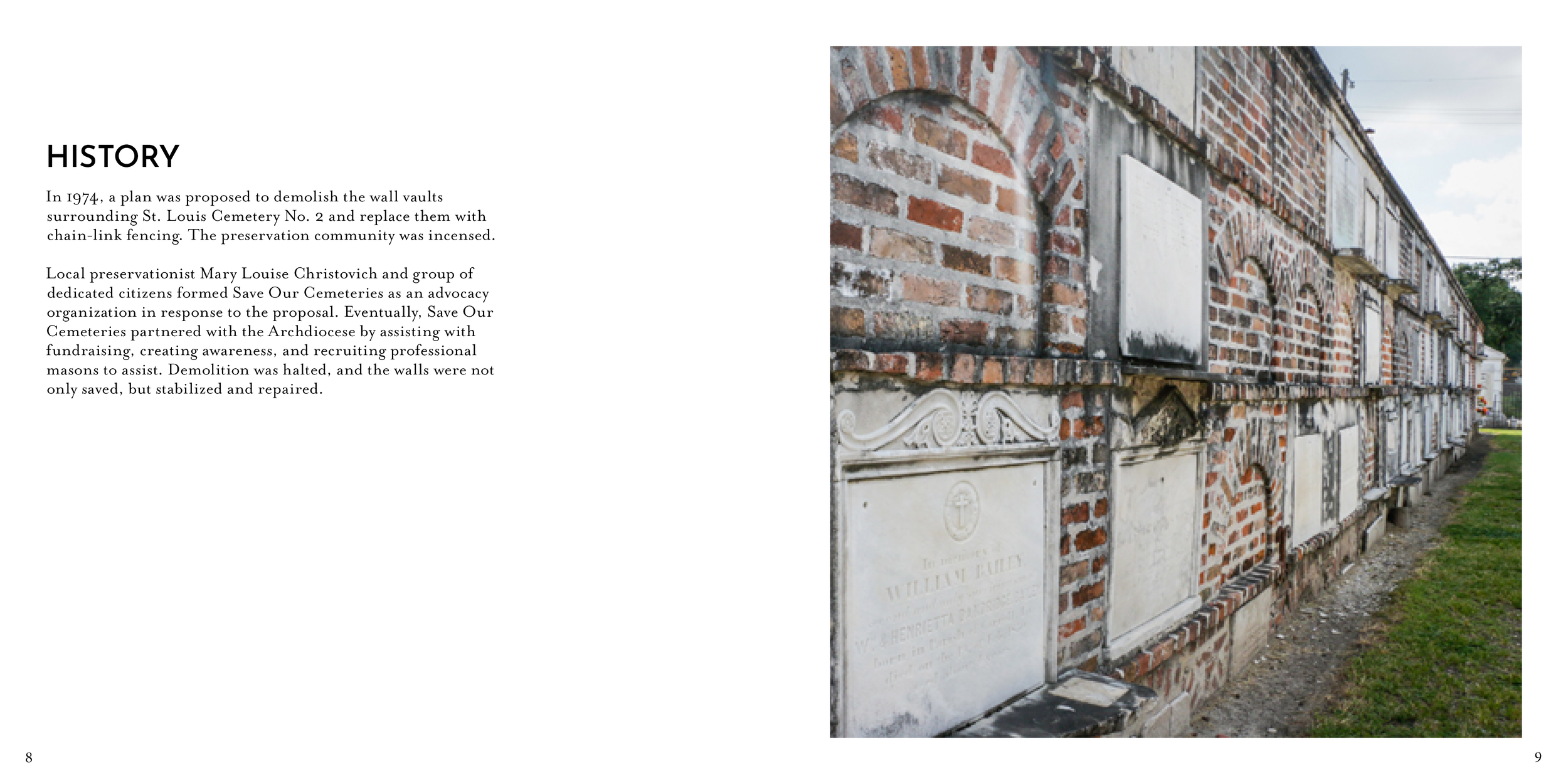
Finals

In this collaborative project, my team and I created an admittedly fake pizza restaurant called Futurizza. Our goal was to choose a font and showcase it in any way we wanted. We felt that by creating a restaurant, it would allow us to create many different types of promotional materials. Together we created everything from dipping sauces with their corresponding HEX Codes to apparel and even a functional social media presence.
Collaboration project with Alexis Scott, Sam Mancha and Cameron Chatt


Through my time at the Rochester Institute of Technology, I had the opportunity to learn and work with many different tools, my favorite being the Letterpress. I would spend hours at Typehigh Letterpress in downtown Rochester making prints for Non-Profits like the Out Alliance and Causewave. This is where I discovered printmaking, which is now one of my favorite art forms to experiment with. The Letterpress is something that not everyone gets the chance to use, and I am incredibly thankful to Tony, the shop owner, for opening his doors to RIT students.


The poster above was created for a local non-profit called Causewave. These posters were to be given out to clients and to hang around the office to offer motivation to employees and volunteers. The press that I used is called the Wesel Press, and it is the oldest of the letterpresses in the shop. Unlike the Vandercook, which is quicker and has rollers to hold ink, the Wesel must be hand-inked each time you run the press. This is very time consuming but well worth the struggle.


All of the prints above are reduction prints. This means that you carve away at the linoleum block until there is nothing left to make an impression. This has always been one of the most fun projects to do because you can only make a limited number of prints.


Then they came for me is a saying by Reverend Martin Niemoller (I highly suggest giving it a quick Google search). One of the things I love about Letterpress is that its basically a puzzle. You always become so attached to the work you create on the press because it takes such a long time to put all of the type together, make sure it fits on the page, choose your paper, and even the ink colors. I definitely have a newfound respect for printers back when the computer wasn’t even thought of yet.


This will always be one of my favorites! Primum Non Nocere translated from Latin means Firstly, do no harm.


Above: 1st Prototypes of the i7+ box redesign


Above: e5 and i7+ Dielines
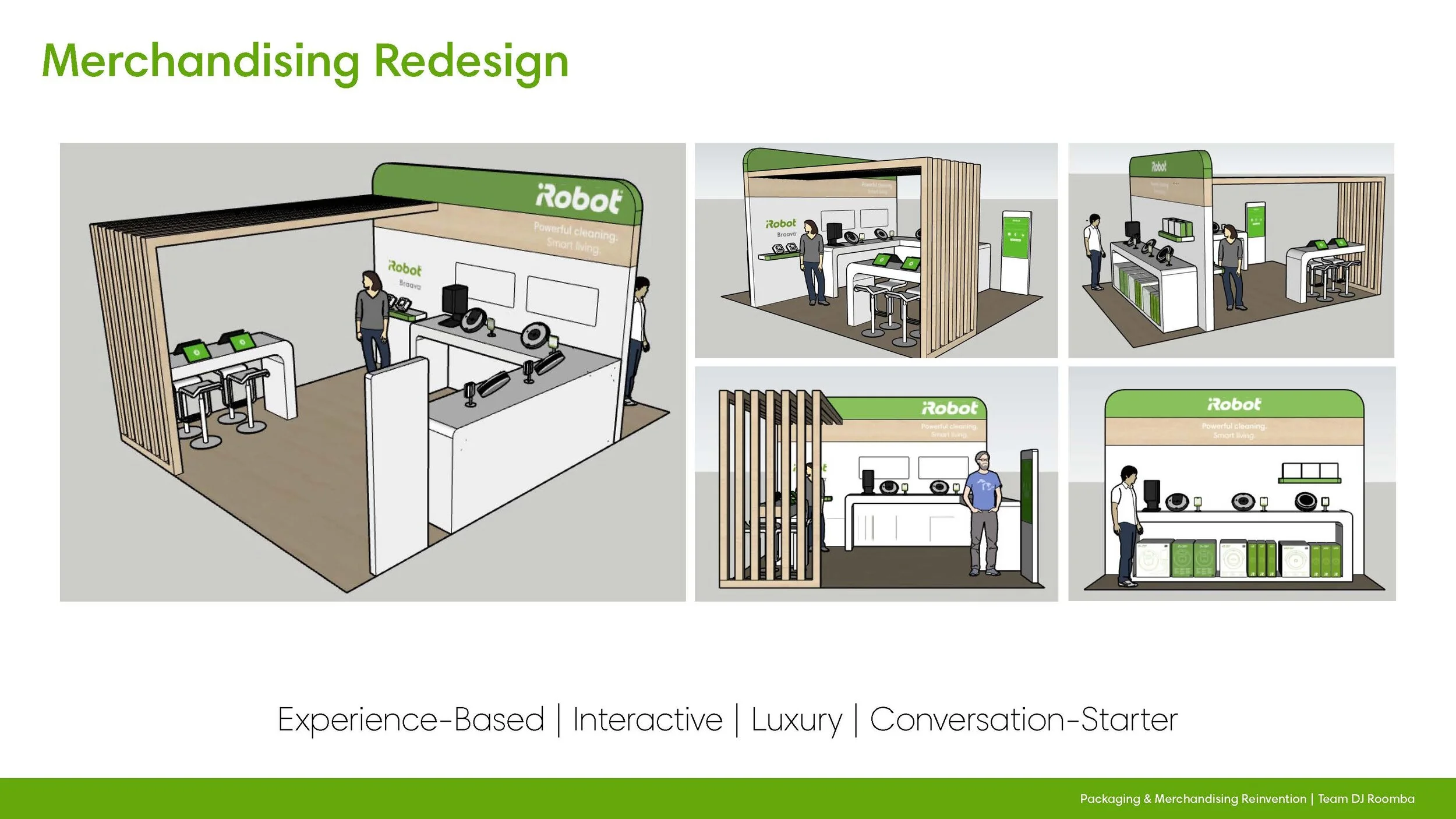
Team: Laura Stockman (Graphic Design), Abigail Dye (Graphic Design), Yale Jeong (Industrial Design), Taylor Butler (Graphic Design) / Project sponsored by iRobot and ChaseDesign / *This was strictly a student based project


Above: Near final sketches done by Yale Jeong


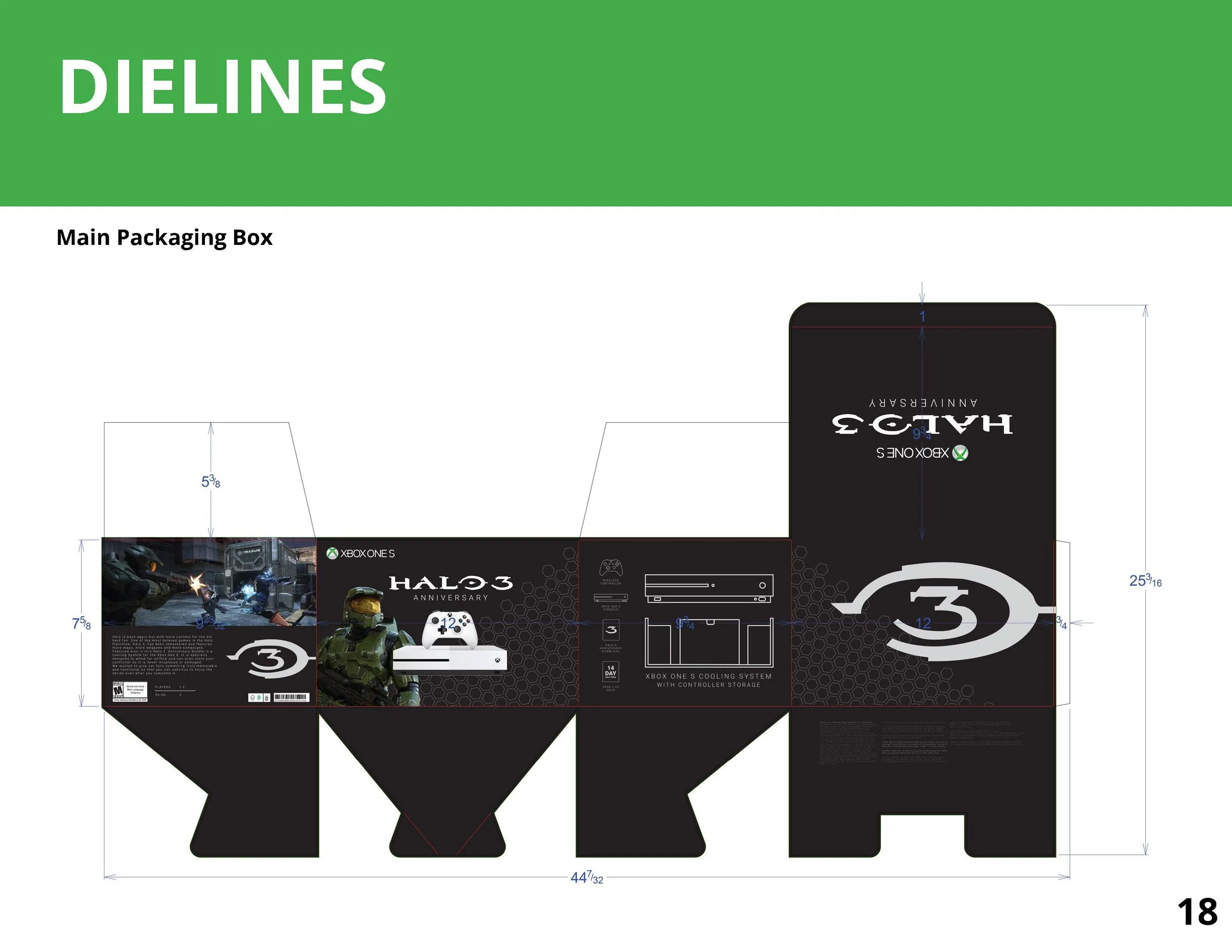
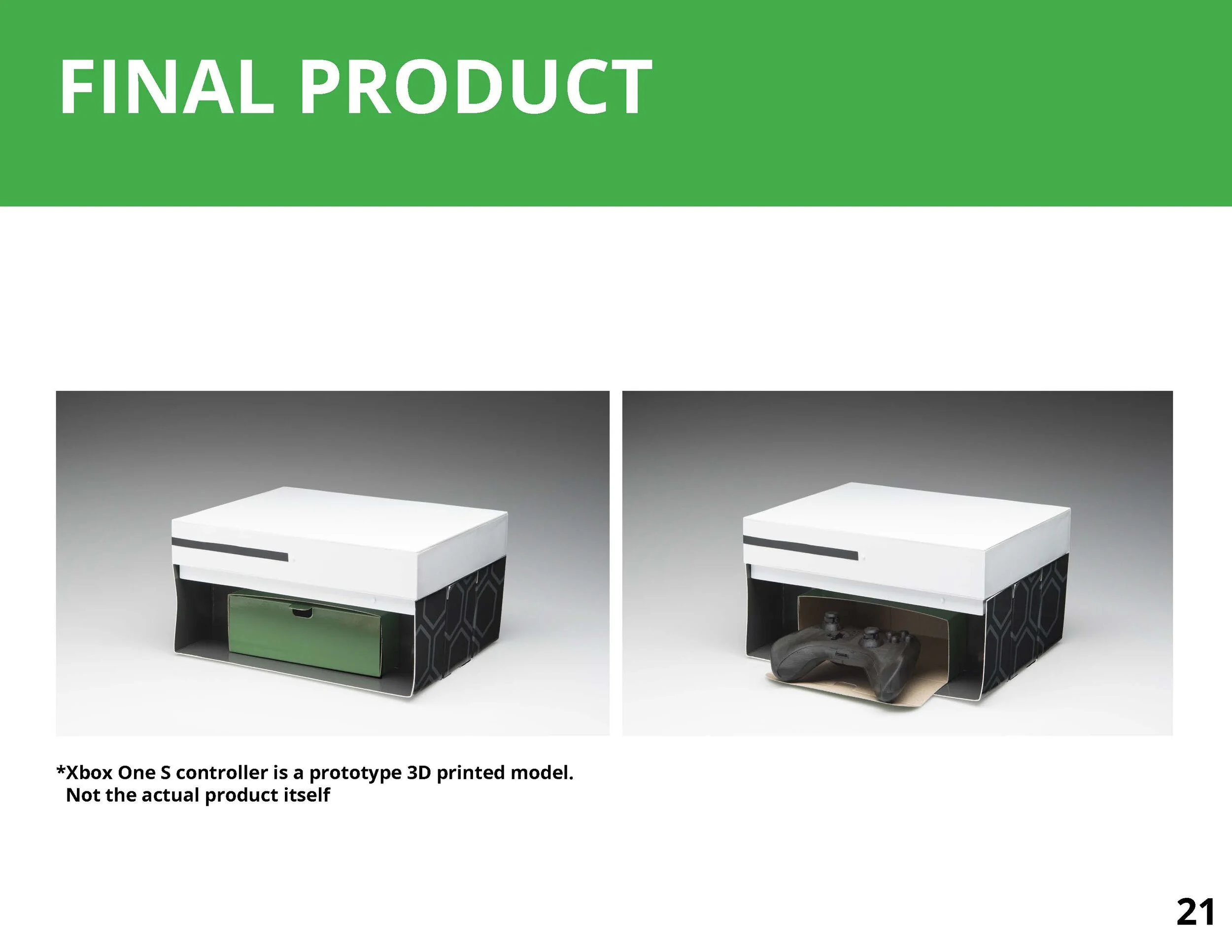
Team: Courtney Morton (Graphic Design), Jarod Lai (Packaging Science), Yale Jeong (Industrial Design), Taylor Butler (Graphic Design) / Project for the 2019 Paperboard Packaging Alliance Student Design Challenge / *This was strictly a student based project and is not affiliated with Xbox or Halo brands.